


What to Say When a Seller Asks Why Their Home Isn't Selling
Sellers resist being told what to do. They respond better to choosing from options you present. Frame the conversation around their goals, then show pathways to get there.


Let’s be real: in this industry, your brand is either working for you or against you. And while most agents are out here scrambling for the next shiny marketing idea, the most successful ones? They’ve mastered the little details that make a massive impact—like fonts.
Yep, fonts.
Before you roll your eyes, hear us out. Fonts aren’t just about making things “look pretty.” Fonts are your brand’s visual voice. When used consistently, they communicate who you are, what you stand for, and whether or not a potential client can trust you.
Think about how fast you recognize the Disney logo. Or Coca-Cola. That’s not by accident—that’s intentional typography working overtime behind the scenes. When real estate agents treat fonts as part of their brand’s DNA, everything starts to click: the website, listing presentation, and Instagram posts—they all flow together. It’s polished. It’s pro. And most importantly, it builds trust.
At Elevated Agent, we say this all the time: if it doesn’t look cohesive, it won’t feel trustworthy.
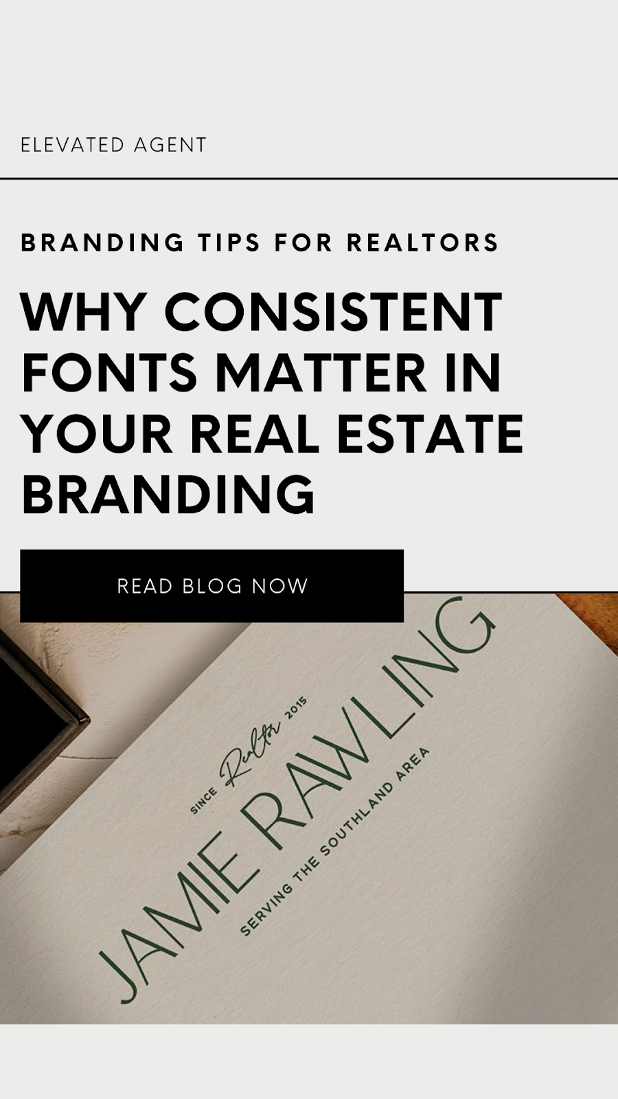
Your font choices should align with your brand’s personality. Are you a luxury agent? Sleek, elegant fonts will communicate sophistication. If your brand is more modern and tech-savvy, clean, bold fonts will reinforce that identity. Whatever your niche, your fonts should reflect the experience you want clients to have when they work with you.
Consider your audience, too. If you target high-end buyers, classic serif fonts may resonate with them. If you specialize in first-time homebuyers, a friendly and approachable sans-serif font might be the better choice.
The goal here? Let your fonts reflect the experience of working with you.
Beyond just picking fonts, how you use them matters. A good visual hierarchy helps guide readers through your content. Here’s a simple breakdown to help structure your branding:
Headlines: Go bold. These should grab attention like your best listing photos.
Subheadings: Complement the headline, guide the eye, and give the reader a reason to keep going.
Body Text: Clear, easy-to-read fonts make your message feel professional, not cluttered.
This structure makes your marketing materials easier to scan, keeping potential clients engaged. Think about how clear road signs are designed—you want your content to be just as effortless to navigate.
Ever seen a brand with mismatched fonts all over the place? It feels messy and unprofessional. Inconsistent branding can confuse potential clients and make you look less credible. But when your fonts stay the same across all platforms—your website, listing presentations, email templates, and social media posts—you reinforce brand recognition and trust. Clients will start to associate a specific look and feel with your name, making it easier to stand out in a crowded market.
Pick 2–3 fonts MAX that align with your brand’s vibe.
Make sure they’re readable (especially online).
Create a font hierarchy: headline, subhead, body.
Keep it consistent across every piece of marketing.
Use a new font every time you open Canva.
Ignore how different fonts feel—fonts carry energy.
Forget to scope out what your competitors are doing (then do it better).
Start Small, Stay Consistent
Branding doesn’t have to be complicated. By simply choosing and sticking to a set of fonts, you can instantly elevate your marketing and make a lasting impression. So whether you’re creating a new listing presentation or updating your social media, let your fonts work for you—building trust, recognition, and a polished real estate brand that stands out.
Typography in branding isn't just about choosing fonts—it's about telling a story. Here are some compelling examples of how brands use typography to enhance their identity.
Coca-Cola's typography exemplifies timelessness and tradition. Its iconic Spencerian script, used since the late 1800s, evokes a sense of heritage and classic charm. This distinctive font choice reinforces Coca-Cola's enduring brand image, connecting generations through its recognizable style.
Airbnb designed a custom font to reflect its commitment to creating a welcoming atmosphere. This bespoke typeface communicates warmth and accessibility, ensuring legibility across all platforms. By opting for a unique design, Airbnb aligns its font with its core values of belonging and inclusivity.
Vogue utilizes the Didot font to signify elegance and sophistication. Known for its high contrast and modern serif design, Didot complements Vogue's identity as a fashion authority. The typeface conveys the magazine's dedication to luxury and cutting-edge trends, enhancing its prestigious status in the fashion world.
Maya Pet combines modern aesthetics with historical elements in its custom-created font. This unique typography bridges contemporary style with timeless qualities, aligning with the brand's narrative. The carefully crafted typeface reflects Maya Pet's blend of tradition and innovation, creating a memorable visual identity.
If you want to look like the go-to agent in your market, your fonts can’t be an afterthought. They’re a visual handshake. A digital business card. A branding decision that quietly (but powerfully) communicates your value before you say a word.
So go pick your fonts, lock them in, and use them everywhere—from listing presentations to your IG Stories. Because at Elevated Agent, we believe your brand should be just as elevated as the service you provide.
0 comments


